Daisy


Timeline: 13 weeks
My Role: Product & UX Designer
Tools: Figma
During the winter semester of 2022, TAMID at Michigan worked with Daisy Management, a property management service in New York City. During this project, I recognized a gap in Daisy's in-house applications. They created products for superintendents and boards but lacked a product for their residents. Throughout the semester, I worked on creating an app for Daisy's residents.
PROBLEM OVERVIEW
Apartment complex, condo, and co-op residents need an easier way to interact with the property management and communicate with the managers more effectively and efficiently so that residents are better informed.
SOLUTION OVERVIEW
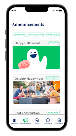
I designed Daisy' residential mobile app to allow tenants to pay their rent/bills, chat with Daisy in real time, access any documents, view announcements, and RSVP to events all in one place.


Pay, Ledger, Wallet, Auto Pay
Announcements & RSVPs
Chat with Daisy
Document Repository
IMPACT
Daisy agreed with the gap I identified within their product portfolio. After reviewing my prototype, my point of contact accepted the design and sent it to their Head of Product for implementation planning.
Understanding the Problem Space
Using Daisy's research on the market, product and service motivation, and potential users, I gained an understanding of the greater property management industry and tenants' challenges and desires. At a high level, Daisy's research concluded the following:
BENCH Research
Tenants are frustrated by the inefficiencies of current property management systems
Tenants would welcome the digitization of their management communications
Users have enjoyed Daisy's products thus far, so creating a tenant app has great potential
Empathy Mapping and Persona Development
To deepen my understanding and visualize the bench research's conclusions, I created an empathy map and persona. The empathy map highlights that users value efficiency, community, and staying informed and would like Daisy's residential app to be mobile first . The persona demonstrates actions, thoughts, and motivations that support the empathy map.


Empathy Map
Persona
Design Process
Ideation
When ideating, I knew I wanted to create a clean and simple interface that would best highlight Daisy's features. The features I chose to highlight are payments, announcements, a home screen, a chatbox, and a document repository.
Wireframing
After determining which features would be best to highlight, I created sketches to help me discover the best layouts. The wireframes below highlight how this step in the design process helped me balance content and whitespace and determine ordering and button shapes.

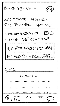
This sketch shows Daisy's home screen. On this screen, I knew I wanted to include any time sensitive notifications, a method to visualize information, such as dates for events and service requests, and highlight other ways to contact Daisy.
Given that this one screen would house three sections, I needed to be mindful of lack of white spaces and lack of emphasis. From this wireframe, I knew I wanted to use color to differentiate between sections and I needed to resize text.
Welcome Screen
Wireframe
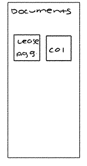
Secondly, these sketches show Daisy's document repository. Based on Daisy's research, I knew I needed to include Lease Agreements and Certificates of Insurance as example documentation; however, I wanted to create a design that would leave space for any other documents. With this in mind, I needed to determine the layout for these buttons.
I could list all of the documents or use square buttons. I decided to use the first layout to decrease the chance of a document name not fitting in the box/being cut off.


Documents
Wireframes
Prototyping
The next step in my design process was creating an interactive prototype on Figma to demonstrate possible user journeys.
I used Daisy's current branding, such as colors, fonts, and logos, within my UX design.


Figma Prototype Dashboard
